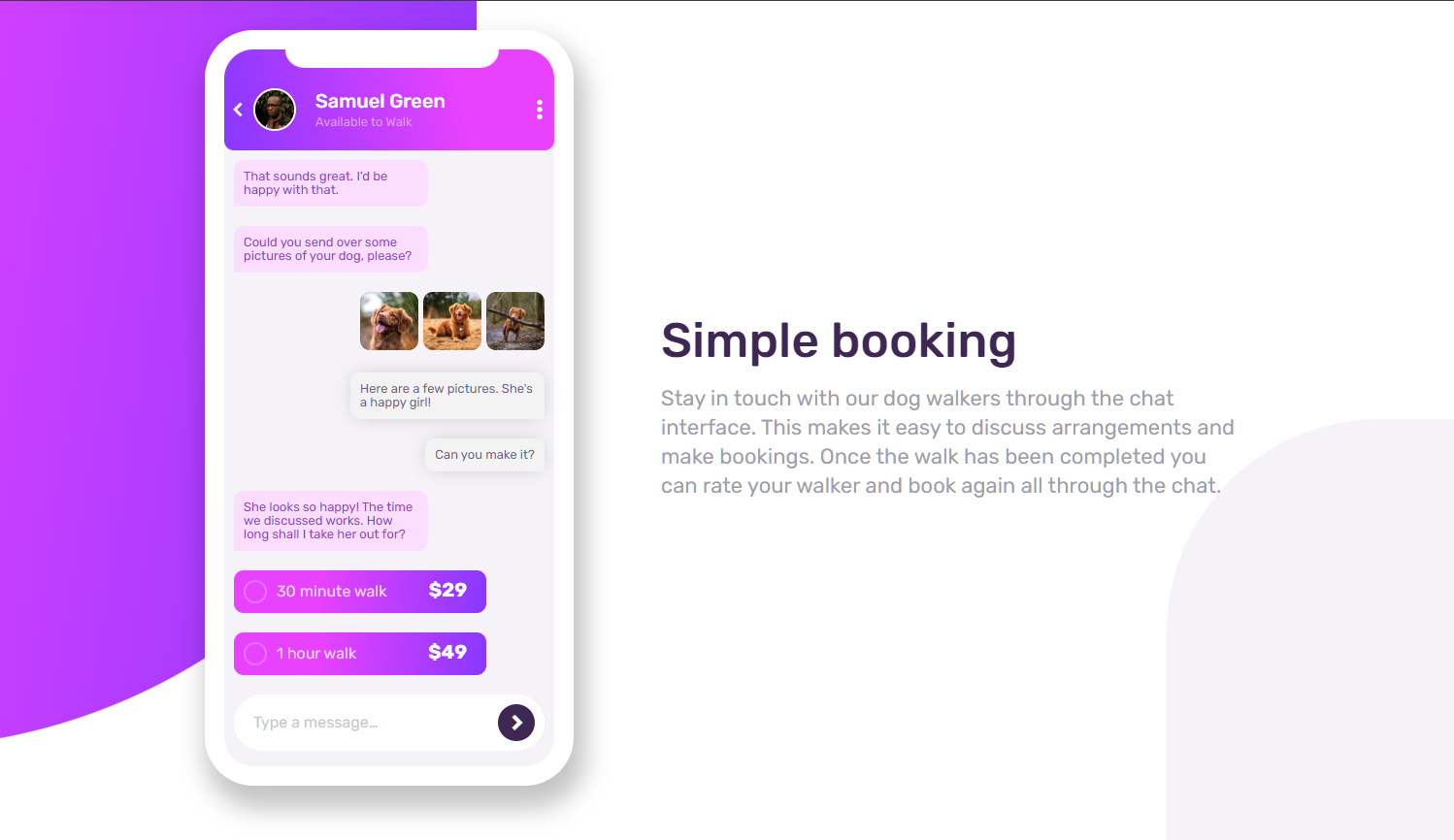
This project is courtesy of the Frontend Mentor
This is built using HTML/CSS and the main challenge is to build the chat illustration with pure CSS and no other resources, aside from the images given, is being used.
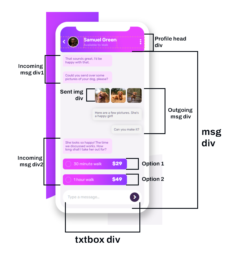
The important part of the challenge is to put each elements to their respective divisions. In this case, the profile head will have its own division, and the main messaging part will have its own division with sub divisions for the message bubbles, 'sent photos', time selection with checkbox, and the textbox styling.

You may have noticed that the messages have a wrapper that separates from the profile head. This is my way to put different styling that only concern the main messaging interface (E.g. background color, element spacing, padding, etc.).
I have also applied the learning of using pseudo-elements such as the ::before to add the
accent decoration behind the phone and the::after selector to add the style of a phone
notch.
As being shown below is the code snippet on how I did the phone notch with the ::after
selector
        /* Add a phone notch */
        .phone::after{
            content:'';
            position: absolute;
            margin-top:-37rem;
            margin-left:3.15rem;
            width: 11rem;
            height: 1rem;
            background: var(--def-white);
            border-radius: 0 0 1rem 1rem;
        }