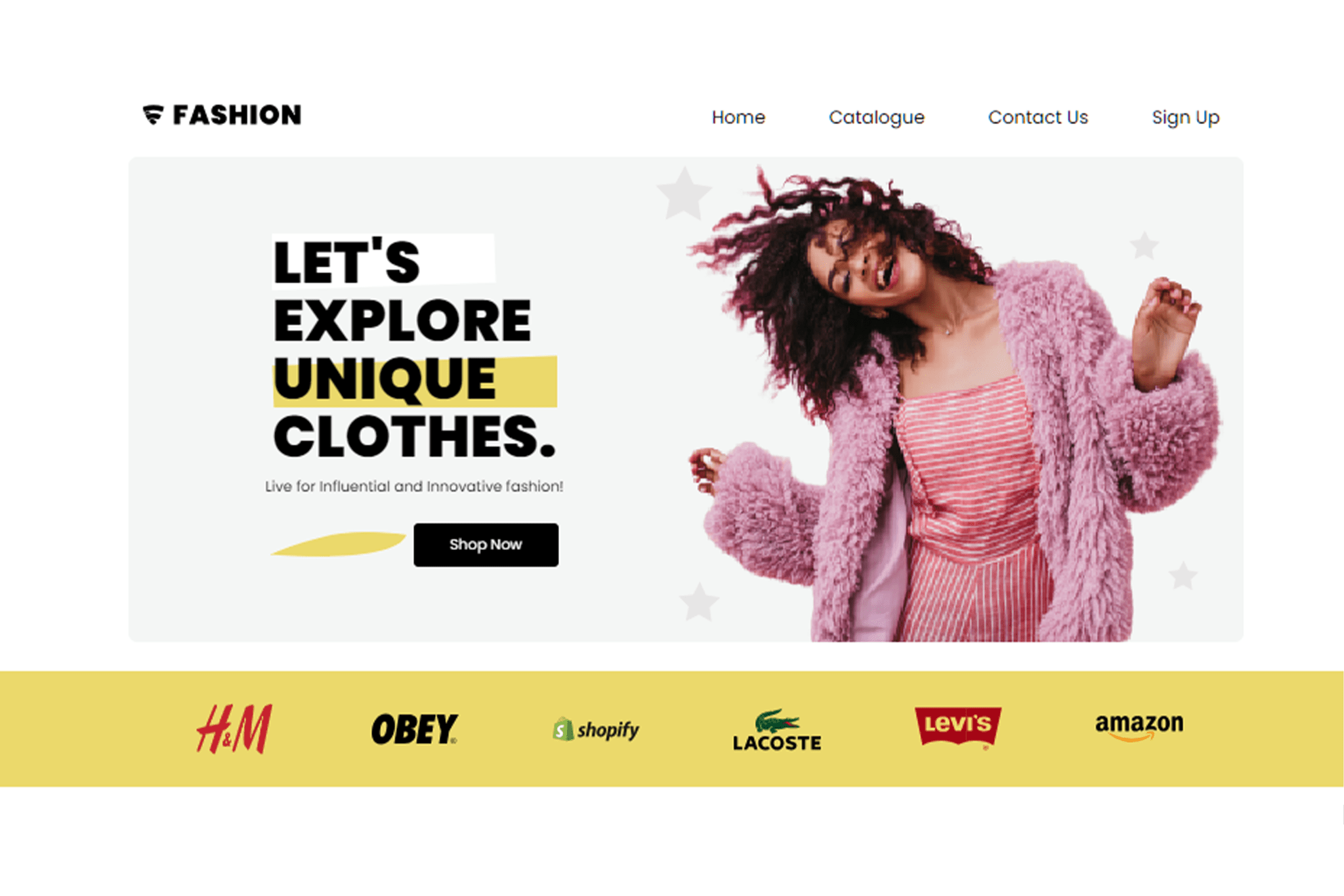
We were tasked to build the Figma file into a website prototype for our midterm project. The desktop layout for the site is given, the challenge is to build another two pages for the site and compose a layout
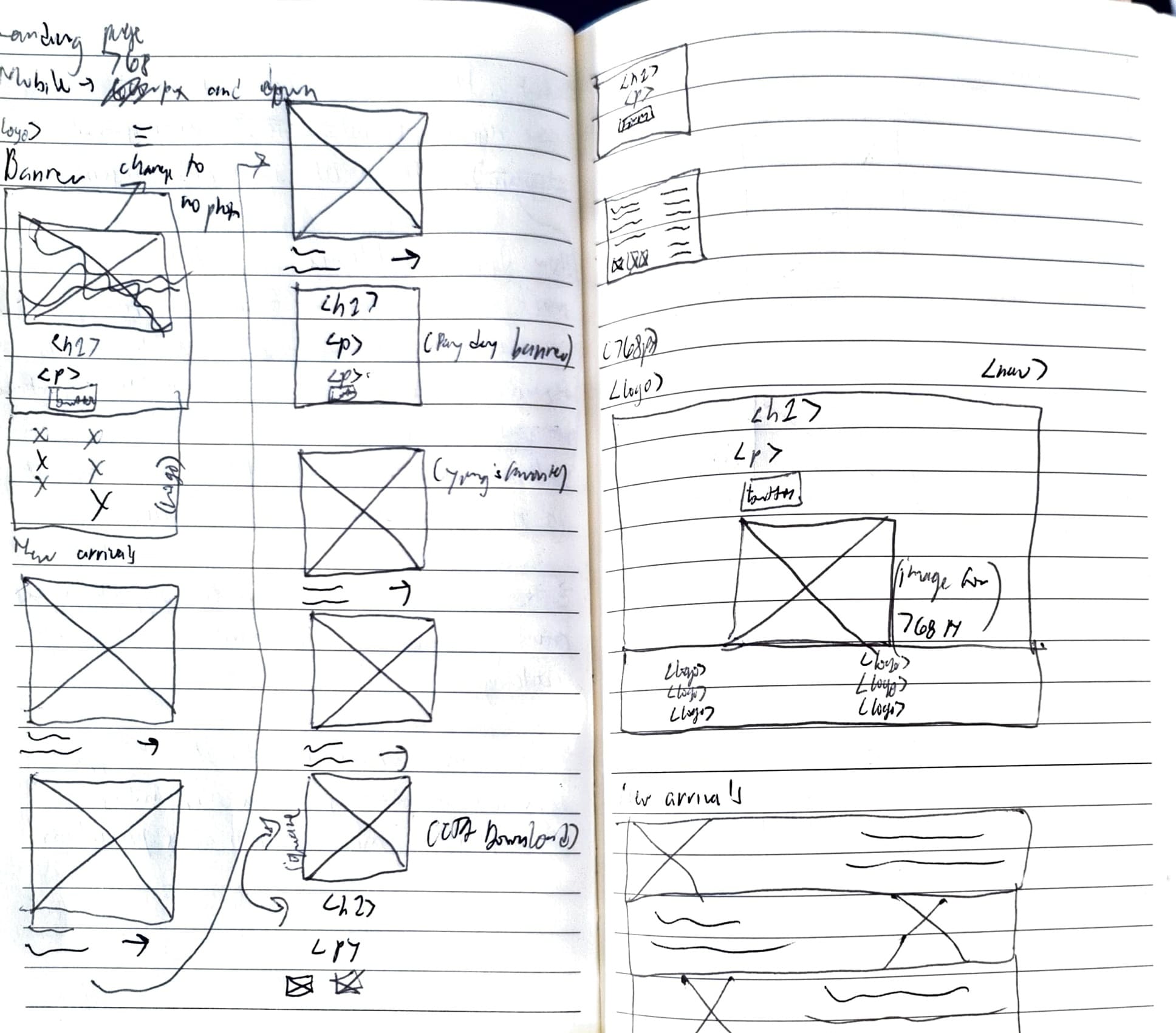
So before I started coding, first thing is to sketch the low fidelity of the website mobile and tablet layout.

I have decided to hide all banner images for smaller screens. The reason for this is to show all CTA right away and to retain these images are overwhelming for views in smaller screens.
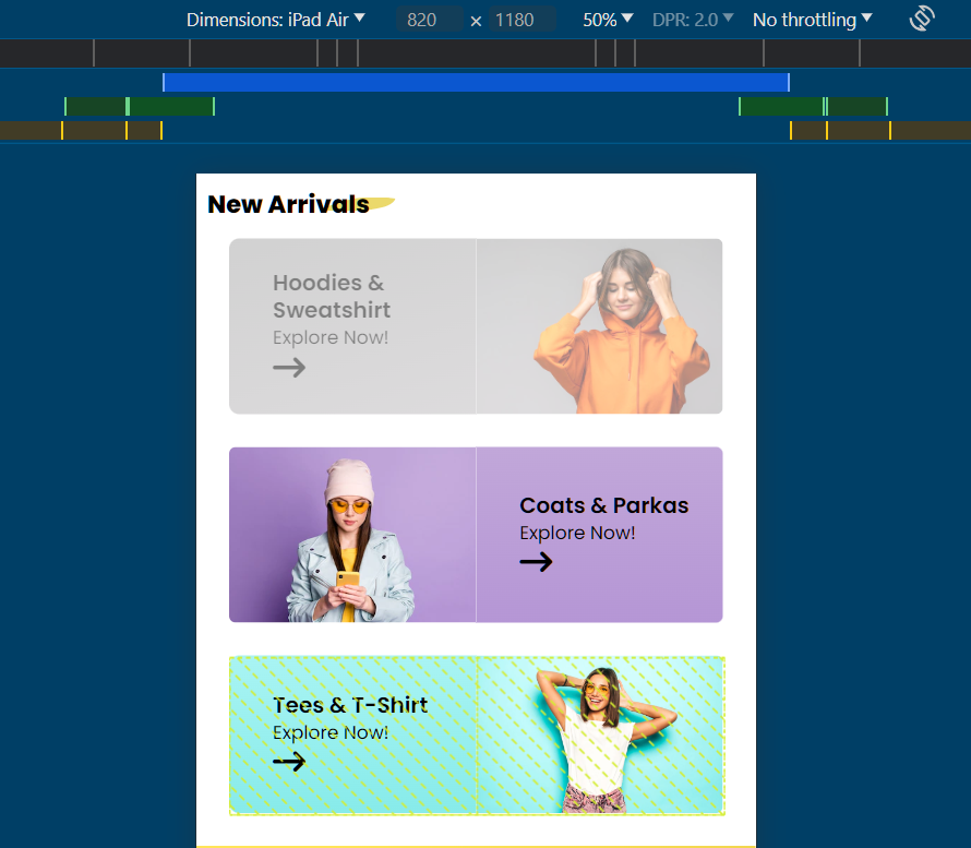
The "New Arrivals" section

Seeing this section for the first time is a bit tricky on my perspective. It had came into my mind that I want to reduce scrolling but at the same time, I also want to showcase each categories in this section. For the tablet layout, I converted the usual vertical card to a horizontal card layout at least the users can see all categories right way.
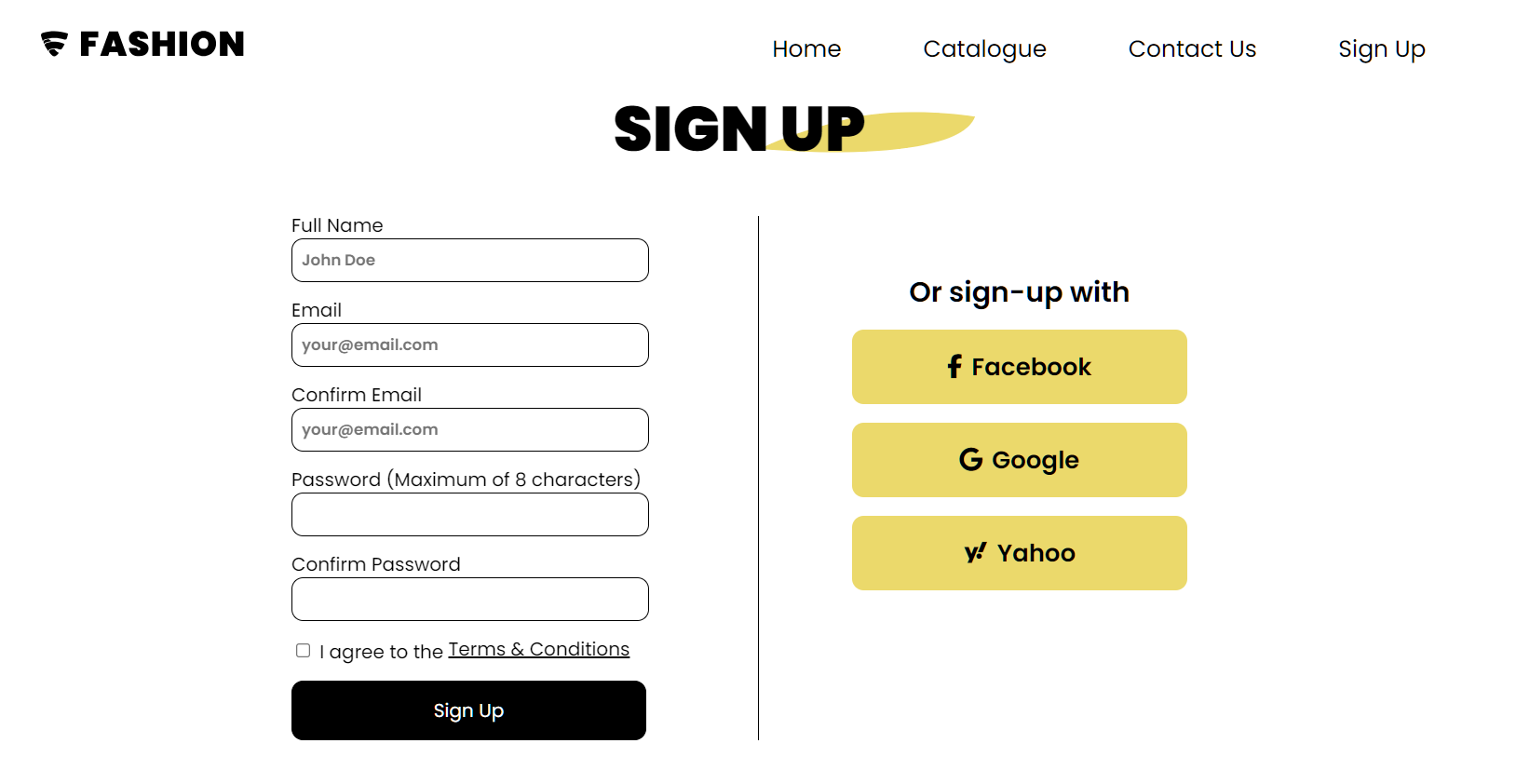
Adding forms

Adding form is easy, but the validation becomes the challenge for me since this is my first time encountering this concept. So what I did is to search for proper input types, added an aria-required property so the user won't be able to skip or forget any component that is required. Adding a min and max property for password as I have stated in the label that it should be maximum of 8 characters only. Below is the code snippet for the sign-up page.
      <form action="thanks.html" method="get">
      <!-- Full name -->
       <label for="fullname">Full Name</label>
       <input type="text" placeholder="John Doe"
          id="fullname" name="fullname" aria-required="true" required>

      <!-- Email -->
      <label for="youremail">Email</label>
      <input type="email" placeholder="your@email.com"
         id="youremail" name="youremail" aria-required="true" required>

     <!-- Confirm Email -->
     <label for="confirm-email">Confirm Email</label>
     <input type="email" placeholder="your@email.com" id="confirm-email"
         name="confirm-email" aria-required="true" required>

     <!-- Create Password -->
     <label for="create-password">Password (Maximum of 8 characters)</label>
     <input type="password" id="create-password"
         name="create-password" minlength="5" maxlength="8"
         aria-required="true" required>

     <!-- Confirm Password -->
     <label for="confirm-password">Confirm Password</label>
     <input type="password" id="confirm-password" name="confirm-password"
         aria-required="true" required>

     <div class="terms">
     <!-- Terms & Conditions -->
     <input type="Checkbox" id="terms" name="terms" value="terms"
         aria-required="true" required> <label for="terms">
         I agree to the <a href="#">Terms & Conditions</a></label>
         </div>

     <!-- Send Button -->
     <button type="submit">Sign Up</button>
     </form>
It was fun throughout the process of building this site and learned a lot of concepts from adding aria, schema, identifying contrast errors for accessibility concerns, and responsive images.