About the project
September 2023 - At the beginning of the term for the Design Foundations course, we were tasked to choose a mock client to create a branding package. In this case, I chose Nordik spa.
The chosen client
Nordik Group's locations set themselves apart with their enchanting sites offering natural scenery in wooded havens with easy access to urban areas. The Nordik spa is always set in a natural environment. In every corner of site, guests are always surrounded with most primitive elements: wood, stone, water, and fire.
Source: Nordik - Who We Are

About the brand
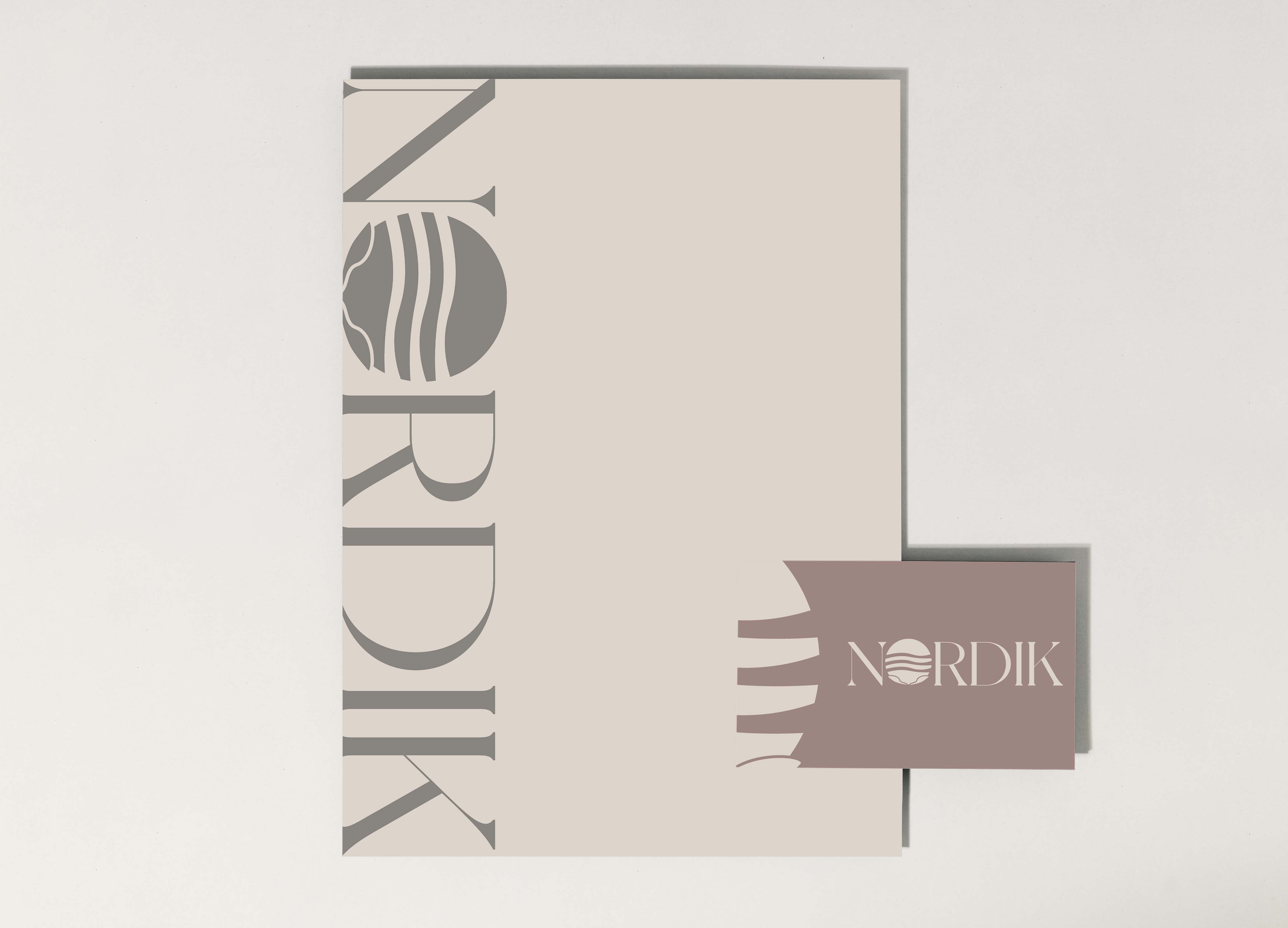
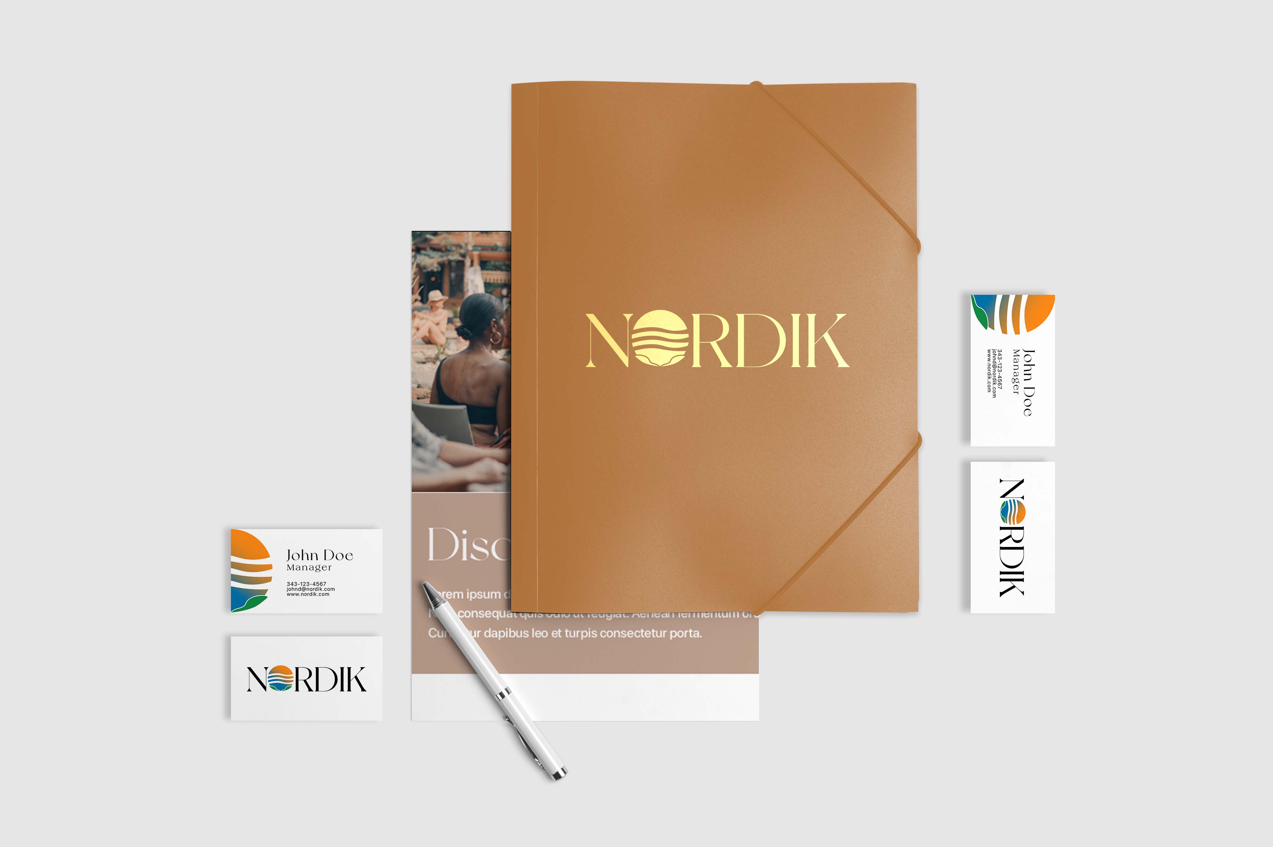
As we prepare for rebranding, we set the objective to convey the message of inviting people to take a break for a while - a place that would be a haven of well-being. The logo redesign showing the shade of blue and orange represent the thermotherapy cycle between hot and cold. The wave represents the Kalla - a saltwater floatation pool feature of the spa. The green leaf indicating the embrace of relaxation through rituals where as it is being used as love letter to the nature. The earthy-color palette and New York font taps into hollistic wellness that promote a sense of tranquility and balance.

