About the project
November 2023 - We are tasked to to create a print-based material that will be used for marketing communication of the mock client, Pop Therapy.
The Pop-Therapy brand
A month before the deadline, I had a meeting with the mock client. She discussed the mission statement of her business - Whether one feels happy or sad, there's a "flavor for every mood."
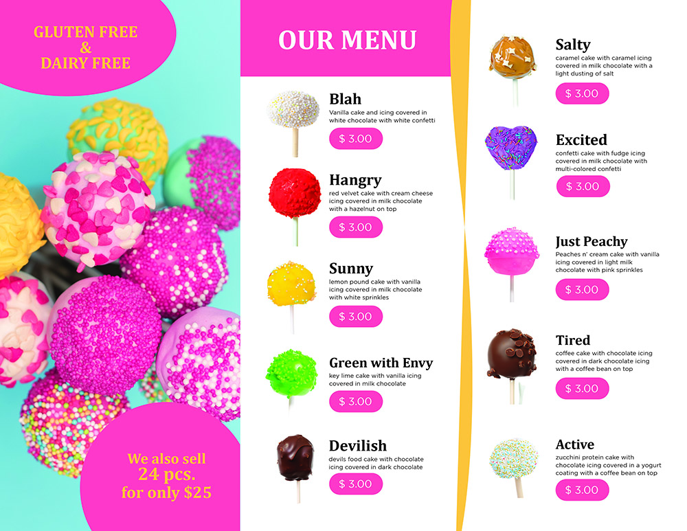
Since the business is expanding, the strategic focus is to amplify the e business to a wider market emphasizing that the products being sold is for all moods of life, we also show that cake pop products is 100% gluten free/safe to be eaten by people who have food allergies and digestive or appetite problems and freshly made everyday.

The logo
Inspired by freefont typeface, it adds a fun touch to transform an ordinary logo.
The circle adds the inspiration of cake pops to emphasize as the main product of the
business.
The spiral and wavy lines adds the flow to catch up with every mood that one
feels in a certain day. Black color will be its neutral look, but depending on the material
or campaign, the color will change.
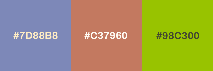
Color palette
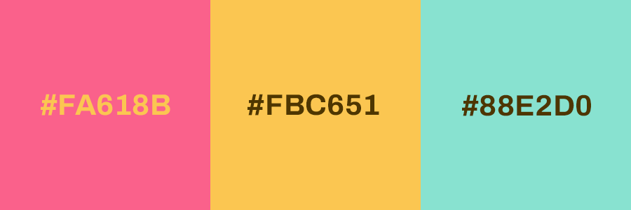
The colour chosen for the Pop Therapy shop is considered to be fresh and delicate, which means it wants to convey that “baked everyday” message. The brochure's primary palette would mostly used with the logo for background, and the secondary palette will be combined on making marketing collaterals for the business.
The tri-fold brochure
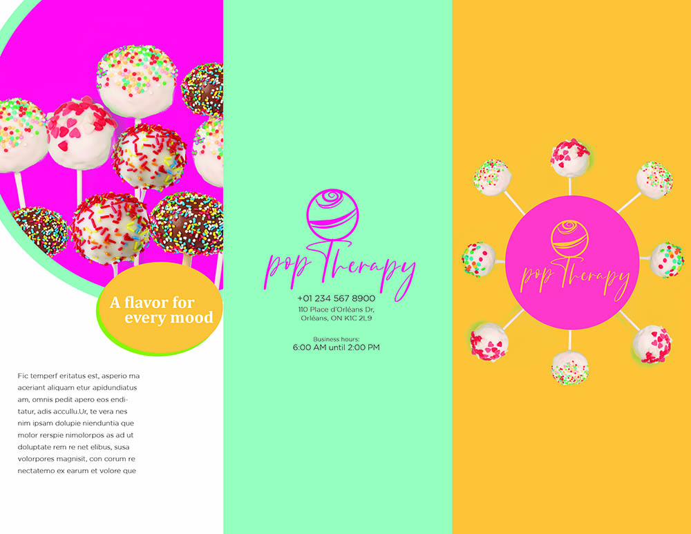
A tri-fold brochure has been decided to be the marketing material of the Pop Therapy shop. With this, we
can create a lasting impression about the business and its products. Also, we can separate different
informations as well give more details about the product.
Typography used for heading is Cambria Bold and the body text is Gotham TT
Light.
