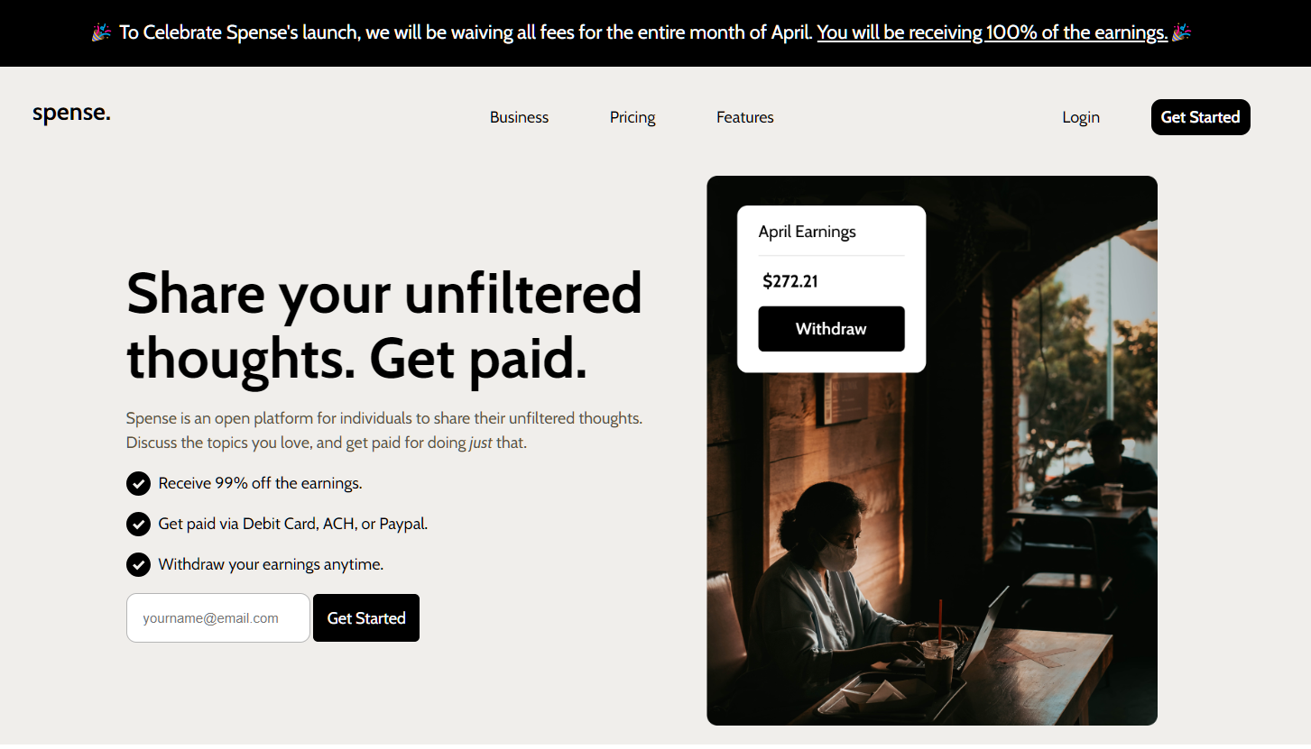
This project is courtesy of the Codewell module. I used this mockup as a practice for responsive images.
All of the assets are provided by codewell so I just determined what images should load for a specific media query. The art direction is used to determine which photo should be displayed on a phone vs. a tablet vs. a desktop.
    <picture class="imgwrap">
        <source srcset="images/hero_mobile.png"
            media="(max-width:659px)" />

        <source srcset="images/hero_tablet.png"
            media="(max-width:1023px)" />

        <source srcset="images/hero_desktop.png"
            media="(min-width:1024px)" />

        <img class="default_img" src="images/hero_tablet.png"
            alt="Woman seeing her earnings from spense">
    </picture>
I used the <picture> that will serve as a container for my images, and inside that are
the <source> elements that represent each image that will be switched to respective
media query. For the first two images, I used the max-width property since it enabled me to
switch image layout rather than using min-width property during the site testing.