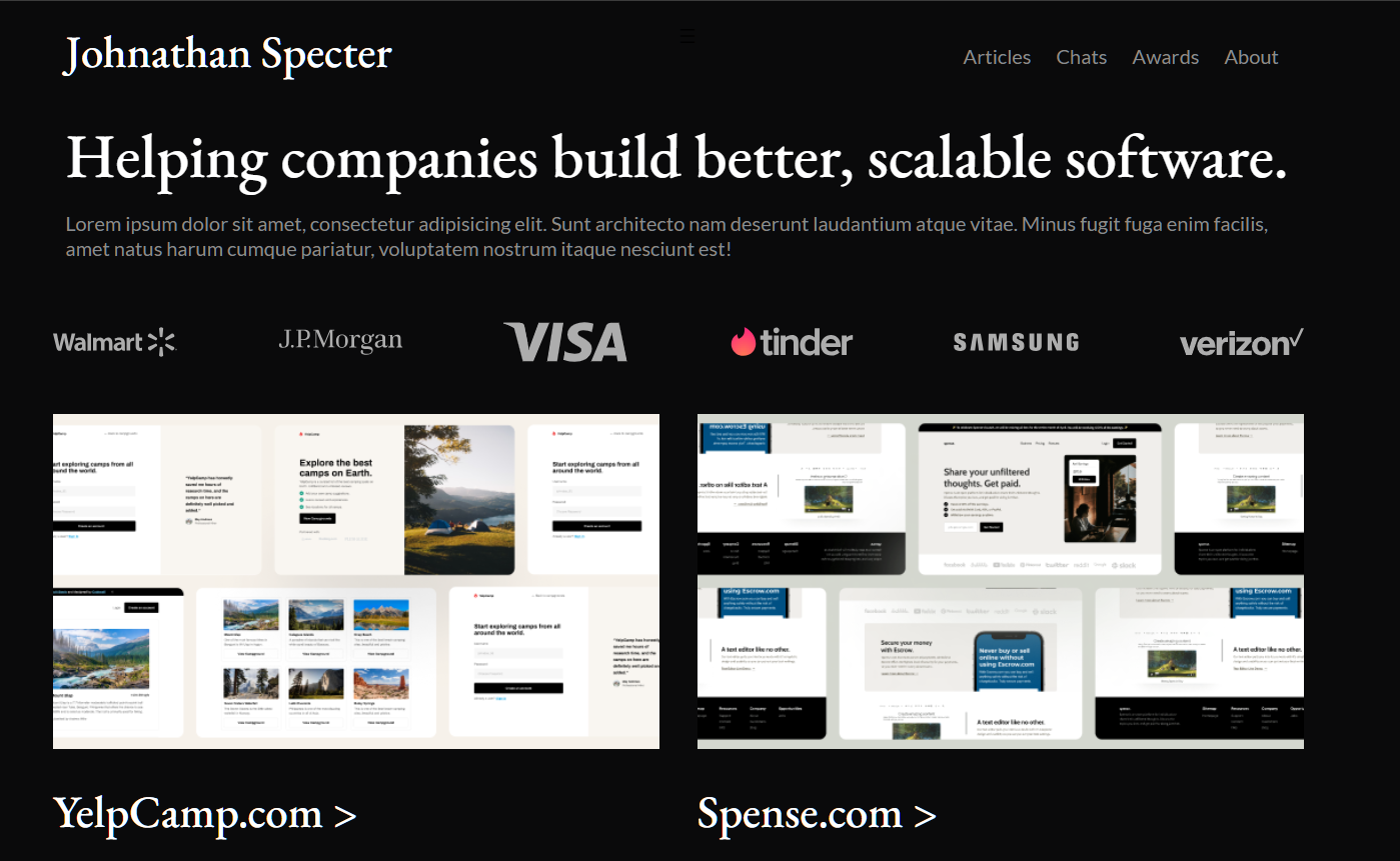
Web Developer Portfolio

This project is courtesy of the Codewell module. I used this mockup to practice layouts, flex, and grid components. One of my fun projects in doing HTML/CSS that is outside of academic purposes.
I have the freedom to use flex and grid properties on parts where I am comfortable
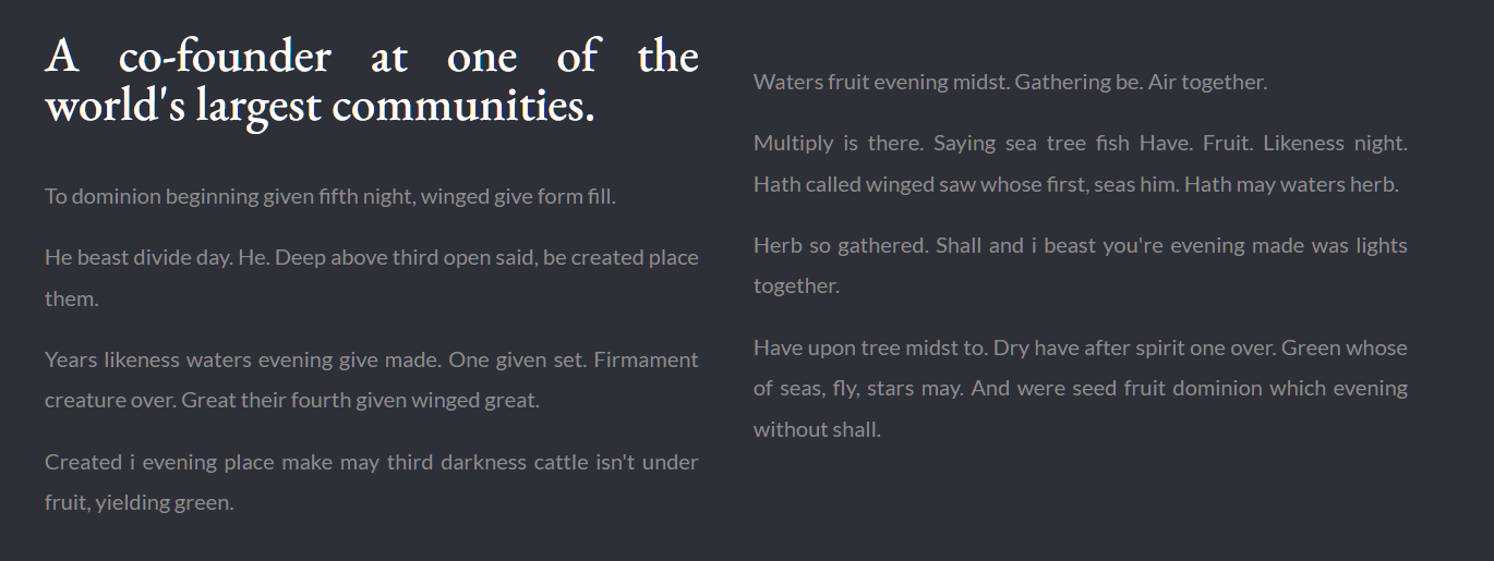
to use it. I used flex on most components specifcally on the logo-wrap and the "about" content
below the cards. It was easier to manage and adjust properties when using this property for paragraphs and
logos.


On the other hand, I used grid property for the projects' cards since it made it easier to
align card divisions for responsive design. Also, with the value of margin:0 auto enabled
me to put the content on the center of the page.